Tuesday, May 25, 2010

...Used to show destruction! (Week 8)

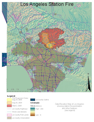
The Following map shows the area affected by the Los Angeles Station Fire in 2009. The Report that below addresses fire in relation to the environment, more specifically how it is an important and natural part of the local ecosystem, as well as the potential effects an extreme fire can have on our local water supply.

The Los Angeles County Station Fire raged through the Angeles Forest and surrounding areas from August 26, 2009, through October 16, 2009. In this time span, the fire burned about 160,577 acres, claimed the lives of two fire fighters, destroyed 209 structures (89 were homes), and cost the state over $93.8 million to fight and finally extinguish. The featured map shows the spread of the fire during the first week, as well as distinguishes the urbanized part of Los Angeles from the less populated parklands (where the fire occurred). I will refer to the features shown on the map as I present a report about the nature of fires in the Chaparral ecosystem of Southern California, and our water resources.

The Station Fire was the largest in a list of intense, powerful, and far-reaching wild fires in recent Southern California history. Why the sudden rise in the intensity of wild fires? There are lots of factors that explain the cause of fires: our dry weather, Mediterranean climate, recent drought (creating dry vegetation/fire fuel), and of course the emergence of Santa Ana winds during the dry, end of summer heat. All these factors contribute to the rising intensity of fires. However, one factor that allows the accumulation of dry brush, and thus providing fuel for crazed wild fires, is actually the lack of fires. Fires are a natural part of many forest/chaparral ecosystems, like those present in the Angeles forest. Here in Southern California though, we tend to prevent any and all fires that may arise, and extinguish those that do arise as soon as possible. Looking at our map, we can see why this would be in our interest. With the Angeles Forest being in such proximity to residential areas, and not to far from the urbanized section of Los Angeles, it is in an effort to protect our infrastructure, cities, and homes from any fire damage by trying to prevent them all together.

It is hard to believe that flames (from controlled fires) have a potential to benefit ecosystems, and even to prevent larger wildfire events. How could this be? Over time, leafs, excess brush, and other dead vegetation cover the grounds of forest/chaparral ecosystems. In doing so, the piles of dead vegetation that cover the soil both prevents seeds from getting into the soil and germinating, thus preventing the rise of biodiversity in the ecosystem, and produces an increased supply of fuel for a future raging fire. The use of periodic controlled fires to reproduce the effects of natural fires, could get rid of excess/dead vegetation, preventing the compilation of too much fuel and thus lessen the chance of a wildfire going out of control. Doing so, will also allow new generations of plant species to germinate and grow in the soil (which is replenished with nutrients after the fire), increasing biodiversity and strengthening the gene pools of the present species. Fire can be used in a positive way before allowing it to emerge as a destructive force.

Directing our attention to the map once more, we see that there are a myriad of streams and rivers in the LA county parklands represented in pink. The extensive network converges to a few large arteries by the time the moving water comes over the mountains and reaches the urbanized area of Los Angeles further south. Keep in mind that parts of these larger arteries are potentially dammed for storage of water/production of electricity, or provide recreational use for some communities. With that said, what sort of negative effects could such a large fire have on our water supply? First off, an increased amount of sedimentation and debris is likely to make its way into streams/rivers, which itself will lead to other results. If much of the debris is organic, such as dead brush, it could have a negative impact on the aquatic ecosystem. The increased organic matter in the water will be perfect for hungry bacteria to feast, and multiply rapidly. The rapid growth of bacteria will decrease the amount of dissolved oxygen in the water, which means fish and other animals will be unable to garner oxygen to live and their populations will decline leading to many more negativities such as eutrophication that would need a separate report to describe. The message here is that it (increased sedimentation) can decrease the water quality that may be used by communities down stream, and/or eventually empty out into the ocean. Another effect would be the debris itself. It could flow and cause blockages down stream, such as at a dam, and thus block hydroelectric production at said dam, or simply pollute a dammed body of water that is used for recreational purposes by the public. Extreme fire events pose a threat to the health of the water sources of Los Angeles County.

In conclusion, aggressive fire events pose a myriad of environmental and other issues. The burning of vegetation near residential areas in the hills creates the threat of destructive mudslides when the winter rains begin, as well as results in immense amounts of air pollution, and threatens the health of the already limited natural supply of water in Los Angeles County. Perhaps it is our fault for preventing the occasional fire nature desires in order to protect our cities. Regardless, further research should be done to find ways of reducing the frequency of extreme fire events, and maybe we will learn that producing small, seasonal, and most importantly, controlled fires will be the way to go.


References:

Barkley, Yvonne. "Wildfire and Its Effects on Streams and Rivers - EXtension." Wildfire and Its Effects on Streams and Rivers. Extension: University of Idaho Extension, Moscow, ID, 20 May 2010. Web. 24 May 2010. .

Bowes, Peter. "BBC News - Learning to Love Forest Fires in Yosemite National Park." BBC NEWS | News Front Page. 3 Dec. 2009. Web. 24 May 2010. .

"Chapparal." Chaparral. Cal Poly Land. Web. 24 May 2010. .

"InciWeb the Incident Information System: Station Fire News Release." InciWeb the Incident Information System: Current Incidents. Incident Information System, 27 Sept. 2009. Web. 24 May 2010. .

Los Angeles County GIS Enterprise. Los Angeles County. Web. 24 May 2010. .

Mapshare: UCLA's Spatial Data Repository. UCLA GIS. Web. 24 May 2010. .

The National Map Seamless Server. Web. 24 May 2010. .

B

Monday, May 17, 2010

Week 7: Spatial Analysis

3-D visual of Santa Monica Mountains (View from inland towards ocean)

Using the USGS website as a source for my DEM, and using the freeways to guide myself, I selected an area containing the Santa Monica Mountains. If I was accurate, the above maps go along the coast beginning at Santa Monica, all the way to Malibu. I chose to map this area because it is where I do a lot of training for my cycling team, and I figured it would be interesting to see how intense the terrain looks on a map. The Shaded relief, slope, and aspect maps have a view from the ocean looking inland. The 3-D model however, is the opposite, and is a view from inland looking out towards the ocean. I moved the 3-D model into this perspective to show all the peaks, or at least most of them.

Extent Information:
- Top: 34.286
- Bottom: 33.995
- Left: -119.132
- Right: -118.494

Geographic Coordinate System Info:
- North American Datum 1983
- UTM Zone 10

Tuesday, May 11, 2010

...the use of different Map Projections (WEEK 6 Lab)

Maps make it easy to put the world in our pocket, that is to say, they allow us to put the world as a 2-D model on paper. However, due to the Earth's 3-D curvature, and its various properties, maps could project the world in many different ways, depending on what exactly the map seeks display. Below are two examples per type of map projection, for a total of six examples. The three map projections shown are conformal, equal area, and equidistant. I shall explain below each display what makes the specific types of projection unique, what it is used for, and other general information that may relate.
The first type of map projections are conformal map projections, shown above by the Mercator and Gall Stereographic maps. Conformal maps have the unique quality of preserving local shapes and angles, and are characterized by the way in which parallels and meridians meet in a perpendicular fashion (this characteristic is not found in the other projections, scroll down and see for yourself). Since this type of map tries to maintain 90 degree angles, it simplifies and fails to acknowledge many properties of the Earth, and as such, the location of items on the maps, and distance between them may be skewed. This is seen in the extreme variation in the distance measured between Kabul and Washington D.C. in the Mercator and Gall Stereographic Maps above. Though Conformal maps are not a wise choice to measure distance or to gather reliable statistical information, the flat nature of the maps allows them to display features such as topography, that could not be displayed easily on a rounded map.
Equal Area map projections as shown above by the Boone and Hammer Aitoff maps, are characterized by the maintenance of proportionality among areas on the map in comparison to the areas they represent in real life. Why is this important or useful? What better way to find out than by applying a real life situation? Suppose you are a government official deciding what plot of land is bigger and more capable of building a new school. You would use an equal area map projection to compare the areas of the plots accurately and make the best selection. Equal area maps are a valuable tool used to compare the size of objects featured on a map.
The third map projection to share are equidistant map projections, displayed by the sinusoidal and equidistant conical maps above. Equidistant maps do just as the name suggests; this projection ensures the preservation of distance between any two points. The equidistant projection does this by taking into account the natural curvature of the Earth and its effect on the area between two points. The two equidistant maps have a smaller difference in destination measured between Kabul and Washington D.C. when compared to the variation of values derived from equal area and conformal maps. Equidistant maps are best used for determining distance.

In conclusion, different map projections exhibit different qualities, and are best at portraying different information. With that said, it is great to have the option of so many map projections. It allows the creator of the map to produce a map that will meet the needs of the user, whether it be a government agency needing an equal area map to decide on a location for a military base, or the military needing an equidistant map to plan a test flight of a new jet.

Tuesday, May 4, 2010

Week 4/5 Lab: Intro to ARCMAP

ArcMap was a surprisingly simple software program to get used to. Not only is it capable of mapping different factors of interest, one could easily put the information into graph/table form just as easily as with other software, such as Excel. This lab allowed me to map out various aspects of a proposed airport expansion, ultimately granting me the opportunity to learn how to use this complex, yet surprisingly user friendly program.

This program is a dream for anyone interested in creating a map. Professional urban planners could use this to map out projects as shown in the lab, and the everyday individual could use it to map something they deem useful. It gives people the power to share spatial information in a relatively simple method.

However, this simple method of sharing information also poses a threat. Though it is a great tool for planning, it is just a model. As such, the computer generated map should not be the sole source of information used to make a decision. After all, no matter how great a computer program is, the Earth is complicated. Therefore, a pitfall of this software is that people may become too dependent on it, when in reality, people should use this as one of many tools (others could be actual geographical surveys),

Another potential pitfall of the program is the fact that it is a piece of software. As with any other piece of software, this program could develop bugs and fail to work properly without any warning. It could also decide to crash for no reason and lose lots of information. However, even with this possible risk (as with any software), ArcMap is a powerful tool to show how a potential project may affect a city, as well as many other things that relate to the world of geography.

Saturday, April 17, 2010

...Used to portray the UCLA Cycling Team's Season (Lab 3: Neogeography)

The above map shows the progress of the UCLA Cycling Team during its 2010 Road Racing Season. The locations highlighted include the route of the race, results, date, and pictures if available.

The idea of neogeography allows people to map anything of interest they would like to take and show the world. In the same way that various networking sites exchange information, neogeography is yet another tool for people to share information. It is an amazing vehicle for people to share their favorite places to eat, point out locations to tourists, or even map out the progress of a sports team as done above. Neogeography is another way of making the world a smaller place by making information available that may not be available otherwise.

Though it is fantastic to think that people can share whatever information they please via neogeography, this method of geography does not come without any issues. Primarily, we have the issue that there are no professionals regulating the information that is portrayed, so some information that is shared may be inaccurate or misleading. Another setback, is that this is a very subjective way of sharing information. For example, if I made a map showing all the best bike shops in town, I may be biased towards one specific bike shop (i.e. the bike shop that sponsors my team), in hopes of bringing the bike shop more customers by taking away from other bike shops in the area.

Overall, I feel neogeography is a great way to find and share information that you may find interesting or useful. As long as the inherent issues are acknowledged, this is a great tool to find primary information for an upcoming vacation, eating excursion, or to follow a teams progress.

Tuesday, April 6, 2010

Week 2, Lab 2: USGS Topographic Maps

Answers to Lab 2 Questions:

1. Beverly Hills Quadrangle

2. Canoga Park, Van Nuys, Burbank, Topanga, Hollywood, Venice, Inglewood (7 total adjacent quadrangles)

3. 1966

4. Vertical Datum - 1929
North American Datum - 1927

5. 1:24,000

6a. 1200 meters
6b. 1.89394 miles
6c. 2.64 inches
6d. 12.5 centimeters

7. 20 feet

8a. 34° 04’ 42” N, 118° 26’ 19” W
34.0783° N, 118.4386° W

8b. 34° 0’ 24” N, 118° 29’ 54” W
34.007° N, 118.4983° W

8c. 34° 07’ 11” N, 118° 24’ 35” W
34.1197° N, 118.4097° W


9a. 560 ft = 170.688 m
9b. 140 ft = 42.672 m
9c. 650 ft = 198.12 m

10. UTM zone 11

11. 361,500 meters East - 3,763,000 meters North

12. 1,000,000 meters squared

13.


14. positive 14 degrees

15. The stream flows South

16.

Tuesday, March 30, 2010

...used to plan bike races

Cycling is one of those sports that never made sense to me until I started to become involved myself. Now, one of the things I look forward to are the Grant Tours. These grand tours are the epitome of the world-wide professional cycling season, taking competitors through some of the most beautiful, historic, and treacherous routes. Lasting about three weeks, the three grand tours, each located in Italy, Spain and France, respectively, test not only the physical strength of riders, but their mental capabilities as well. Below is a short description of each of the following maps in their respective order.

Map #1: The first of the three maps is that of Italy, as made obvious by the boot shaped peninsula. This map was found on Wikipedia, and is a basic outline of the 1909 Giro d'Italia (yes some of these grand tours have been going on for quite some time). The map itself is essentially a natural map showing Italy from space, with the route outlined over it. I found this map interesting because it presents the route very differently than maps nowadays. If you look up a map for this years upcoming Giro d'Italia, you will simply see a basic shape of Italy, with the route drawn over it. This map however, shows Italy in its natural splendor without roads or anything else, making it seem crazy that there is a race through the many different terrains of Italy. Even more impressive, is the fact that there are roads through this terrain that humans have carved out of the natural landscape to make life easier, and bike races possible.

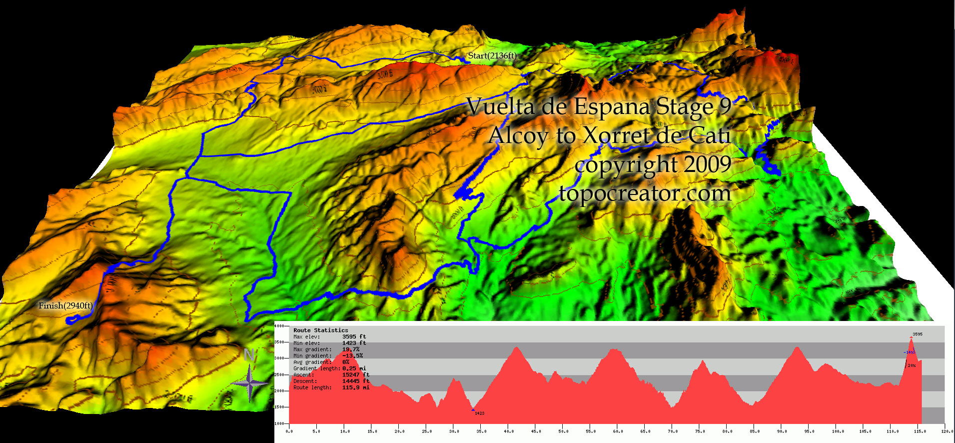
Map #2: The second map represents one of the stages (a stage is a term to describe one day of racing during a tour) of the Vuelta de Espana (Spain). This map was found on a topographic map creation website http://topocreator.com/vuelta1.php. The map itself is special because it shows the topography of stage 9 of the 2009 Vuelta. Rather than simply outlining the course from an overhead view, the colors and shape of the map help identify the profile of the stage. The profile is simplified in the included profile graph, showing how much climbing (riding up hill) riders will have to do. This is an interesting map because it gives you more of a feel as to what the competitors will be facing during their day of racing, as opposed to a simple course outline. Also, cycling teams use such maps in order to plan out and execute tactics during the race that will produce the best outcome for the team by taking into consideration the strength/specialty of riders within the team (climbers, sprinters or all around riders), and the characteristics of the course at hand.

Map #3: The third and final map shows the most prestigious of the three Grand Tours, Le Tour de France. The map was pulled from the official tour de france website (http://www.letour.fr/indexus.html) and shows an outline of the entire race, from the start of the first stage to the end of the last stage. This map is quite simple and does not show much of the mountainous terrain that competitors endure. Instead, it is interesting to see how bright and eye catching the map is. Perhaps it is done to entice people to watch the race on tv during the month of July? Or perhaps France is in the Gold color not to catch attention, but to represent that the overall winner of the race conquers France as well (the leader of the race wears a Gold jersey)? Whichever the case, it is interesting to see how the competitors will move across France during the course of the race.

-Rogelio Pardo
Geography 7 Lab Section 1B