Map #1: The first of the three maps is that of Italy, as made obvious by the boot shaped peninsula. This map was found on Wikipedia, and is a basic outline of the 1909 Giro d'Italia (yes some of these grand tours have been going on for quite some time). The map itself is essentially a natural map showing Italy from space, with the route outlined over it. I found this map interesting because it presents the route very differently than maps nowadays. If you look up a map for this years upcoming Giro d'Italia, you will simply see a basic shape of Italy, with the route drawn over it. This map however, shows Italy in its natural splendor without roads or anything else, making it seem crazy that there is a race through the many different terrains of Italy. Even more impressive, is the fact that there are roads through this terrain that humans have carved out of the natural landscape to make life easier, and bike races possible.
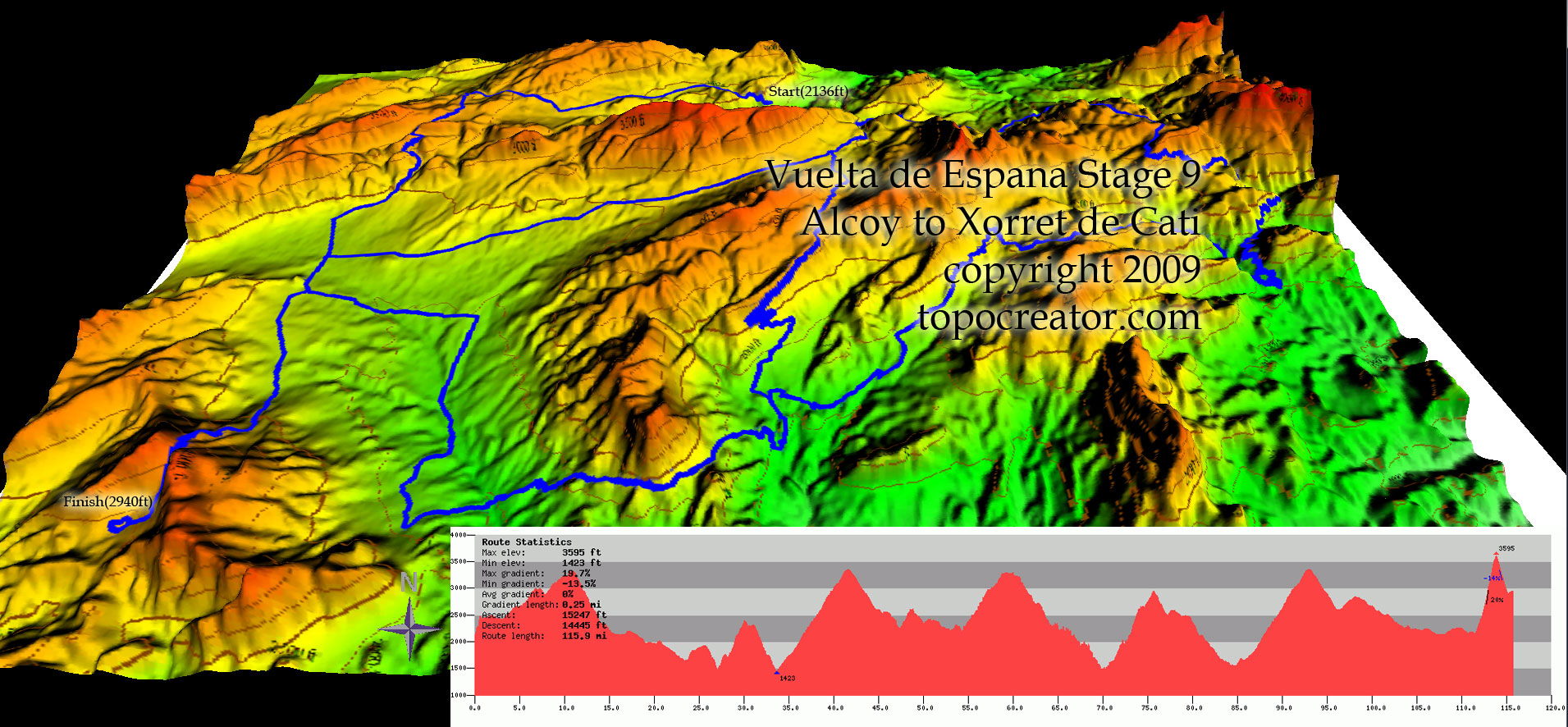
Map #2: The second map represents one of the stages (a stage is a term to describe one day of racing during a tour) of the Vuelta de Espana (Spain). This map was found on a topographic map creation website http://topocreator.com/vuelta1.php. The map itself is special because it shows the topography of stage 9 of the 2009 Vuelta. Rather than simply outlining the course from an overhead view, the colors and shape of the map help identify the profile of the stage. The profile is simplified in the included profile graph, showing how much climbing (riding up hill) riders will have to do. This is an interesting map because it gives you more of a feel as to what the competitors will be facing during their day of racing, as opposed to a simple course outline. Also, cycling teams use such maps in order to plan out and execute tactics during the race that will produce the best outcome for the team by taking into consideration the strength/specialty of riders within the team (climbers, sprinters or all around riders), and the characteristics of the course at hand.
Map #3: The third and final map shows the most prestigious of the three Grand Tours, Le Tour de France. The map was pulled from the official tour de france website (http://www.letour.fr/indexus.html) and shows an outline of the entire race, from the start of the first stage to the end of the last stage. This map is quite simple and does not show much of the mountainous terrain that competitors endure. Instead, it is interesting to see how bright and eye catching the map is. Perhaps it is done to entice people to watch the race on tv during the month of July? Or perhaps France is in the Gold color not to catch attention, but to represent that the overall winner of the race conquers France as well (the leader of the race wears a Gold jersey)? Whichever the case, it is interesting to see how the competitors will move across France during the course of the race.
-Rogelio Pardo
Geography 7 Lab Section 1B